VOXEDIT REDESIGN
MY JOURNEY INSIDE THE SANDBOX
ROLE
UX/UI Designer
PERIOD
2021 - 2025
CLIENT
The Sandbox
SOFTWARE
Adobe XD, Figma
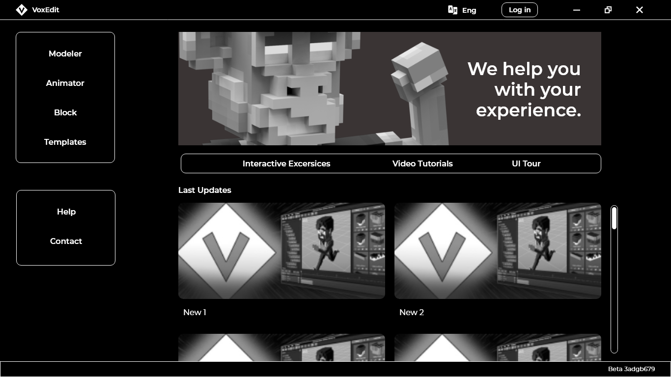
VoxEdit, inside The Sandbox metaverse
First, we need to go with our first question: What is The Sandbox about?
The Sandbox is an online gaming platform that offers an immersive gaming experience within the blockchain, utilizing its cryptocurrency, The Sand. Users can not only play, but also create and monetize their NFTs, lands, and experiences. To this end, TSB Metaverse has 4 main products:
- Dashboard (DSB): Main website that includes the Marketplace, the experiencies and creation softwares.
- Game Client (GC): The game.
- Game Maker (GM): The engine for level designers and users. A tool used to create the experiences without programming.
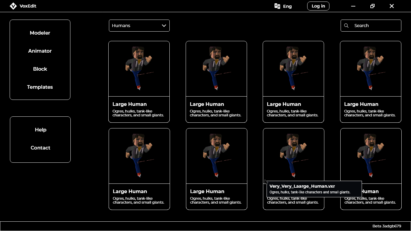
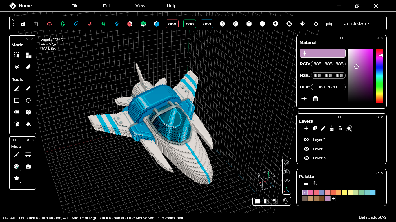
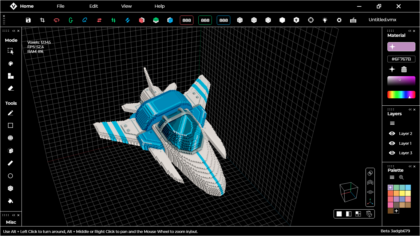
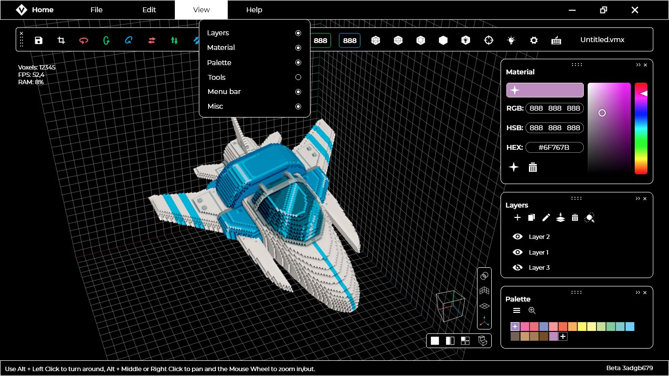
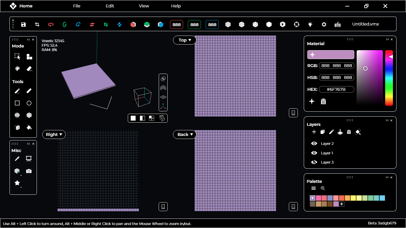
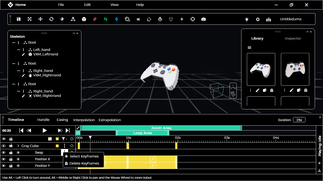
- VoxEdit (VE): The 3D software used to create and animate assets and NFTs with Voxel Art aesthetic, which can be exported to GM, The Marketplace or both. This is the product that I worked on.
 2")
Finding issues and first steps
We had to talk with the team and users about some of the root design problems in the software. We agreed that most of the issues would be need an entire redesign (from both UX/UI and code perspective).
Main Issues:
- Lack of accessibility: contrast issues around the different software themes and highlight colors. The way the code was made wasn’t enough flexible to propose new ways to group UI colors.
- Lack of responsiveness.
- Aesthetic looking “old” (far away from the modern concept of the company)
- Adobe XD wasn’t comfortable for devs.
- Panels not being customizable enough.


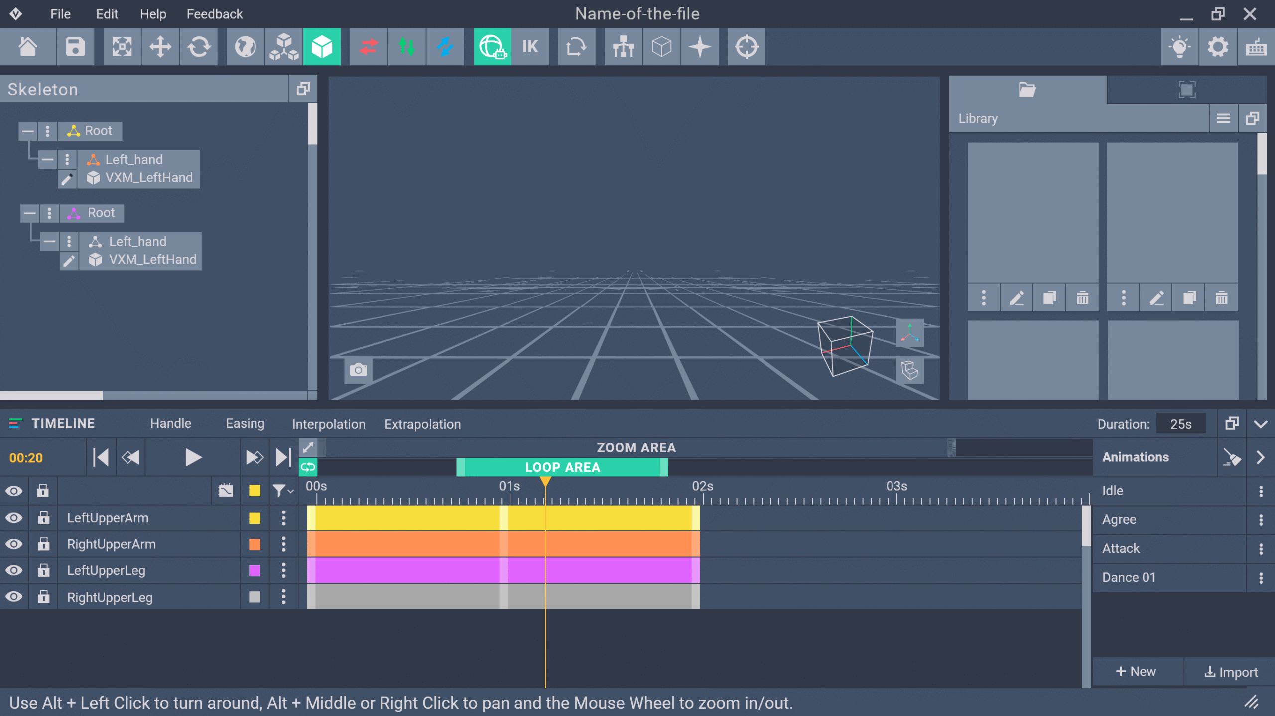
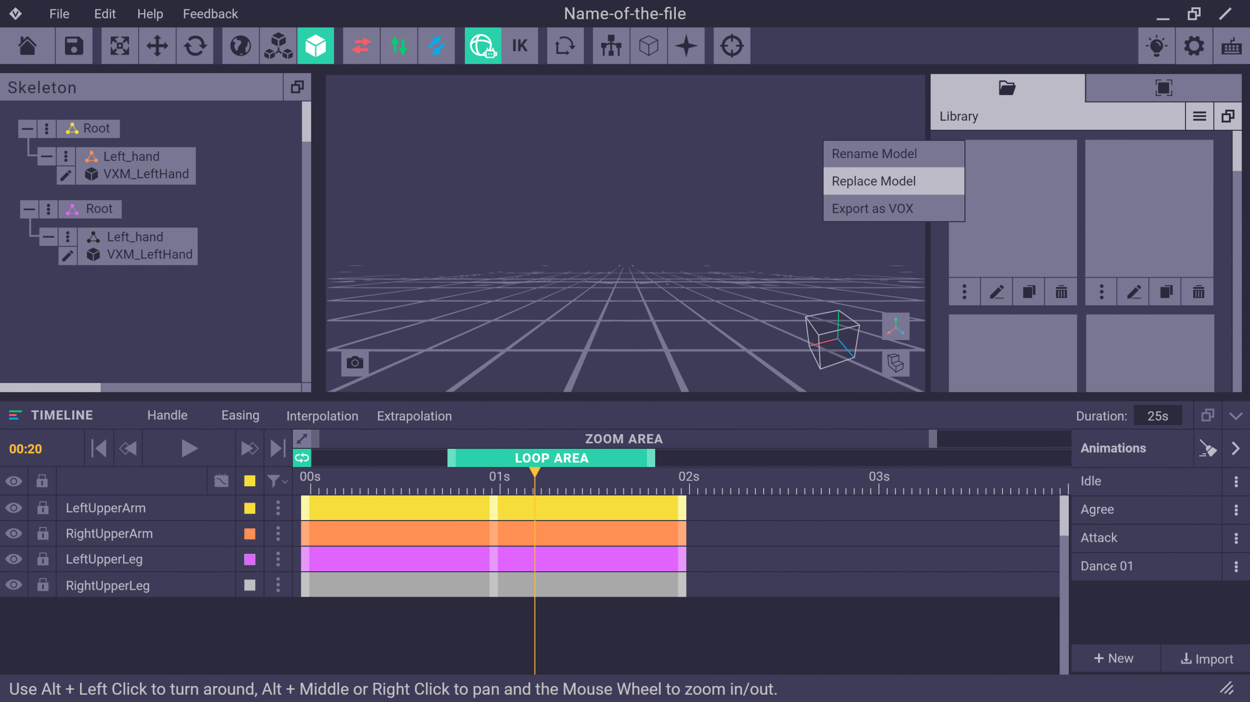
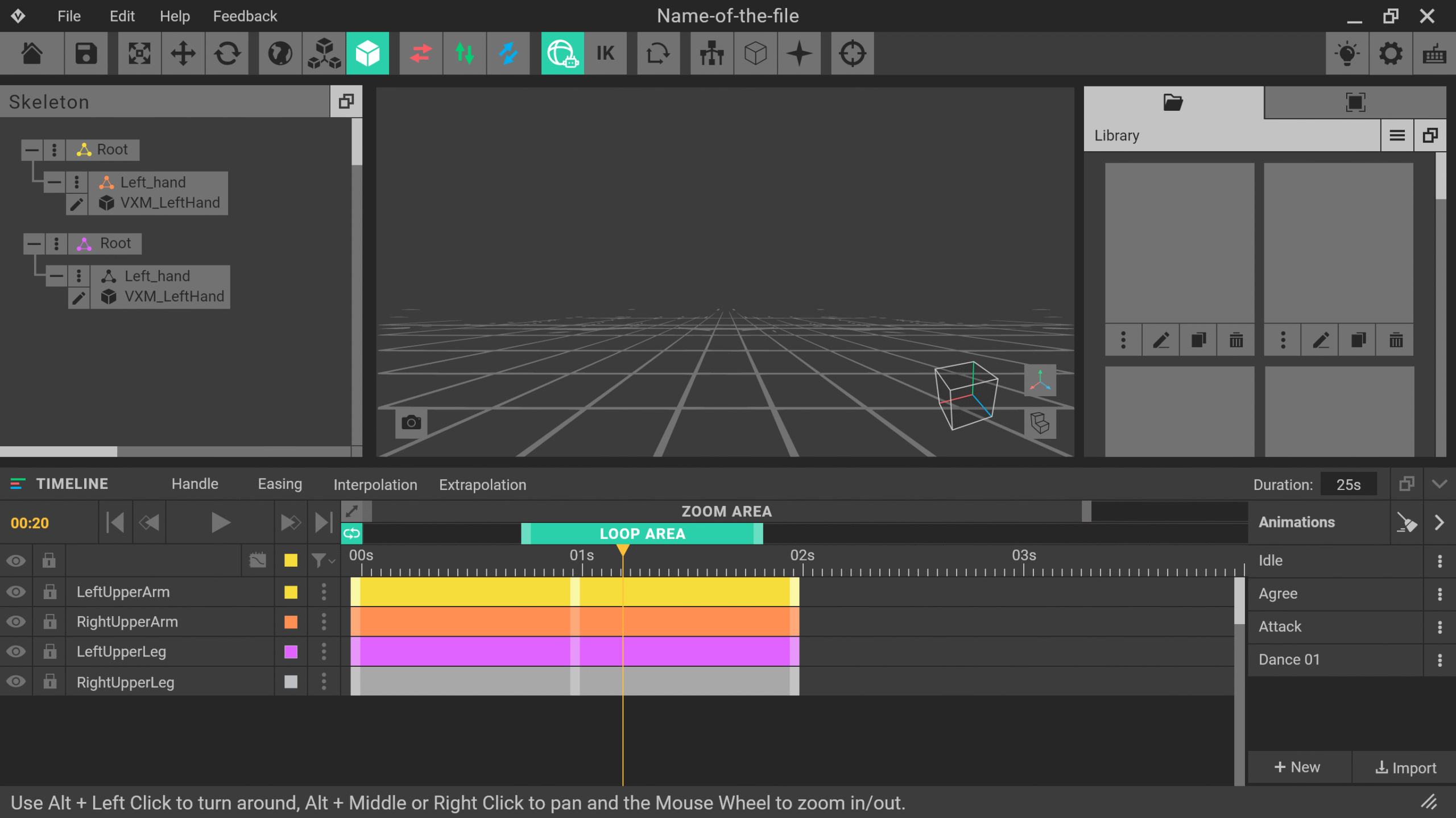
OLD THEMES AND SCREENS
Working closely with users :D
We also count with some advantages and strong points:
- Direct communication with professional voxel artists and animators who were working at the company too.
- This Voxelart software has a differential: An animator rig.
So, we started with some UX classic magic:
- Card sorting.
- User persona profiles: The newbie, The animator and The Voxel artist.
- Benchmarking: We usually took some references from 3D softwares like Blender, Maya, Magica Voxel, Goxel, Qubicle and Spline 3D.
- Flowcharts.
- User testing, heuristic testing and interviews.

Wireframes and sketches
We started thinking about newbies too:
How can we make them to feel welcome? Which is the tone? how about accessibility? How about the UX writing?
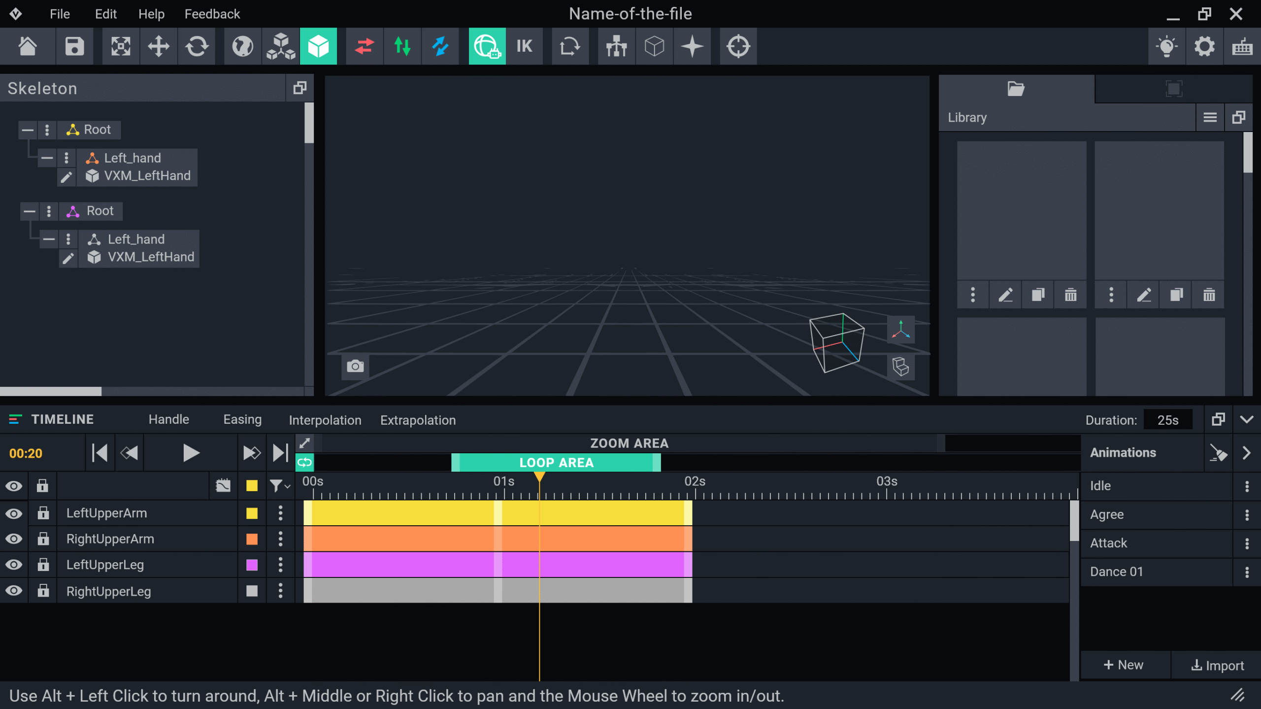
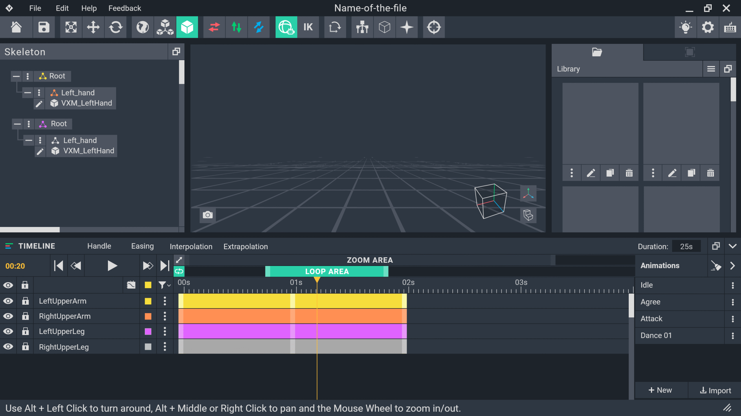
Customizable panels were the main feature for us in the first steps.
It would be handier for newbies and profesional could keep their favorite layouts too.
HANDMADE SKETCES


BLACK & WHITE LQ WIREFRAMES
COSTUMIZABLE LAYOUT EXPERIMENTS


Figma and HQ Wireframes!
An important part of the Redesign was the migration to Figma.
From that point, we were able to start the HQ wireframes step and, together with that, the iteration process.
It was a long jorney with a lot of work for our team, but it really worth it :)
Results!

1. I got promoted to senior

2. Learned advanced Figma

3. Team, users and CEO happy
Working on something cool?
LET'S TALK ABOUT IT :)
GET IN TOUCH
asilosjudith@gmail.com
SOCIAL & MORE

Selected Works